Meridian Group Rebrand
A corporate identity for a family of companies, with one shared structure and a distinct color for every business unit.
- Client
- Meridian Group
- Discipline
- Corporate Branding
- Service
- Corporate Branding
- Year
- 2026
The challenge
Project overview
Meridian Group had grown through acquisitions into six companies with six different looks. Clients rarely knew the businesses belonged together.
We began with interviews across every business unit and an audit of every touchpoint, from websites and proposals to signage and stationery.
The brief
Create one corporate brand that connects the whole group while letting each company keep a recognizable character of its own.
Scope
- Brand strategy and architecture
- Master identity and sub-brand system
- Guidelines for internal teams and partners
The solution
How we solved it
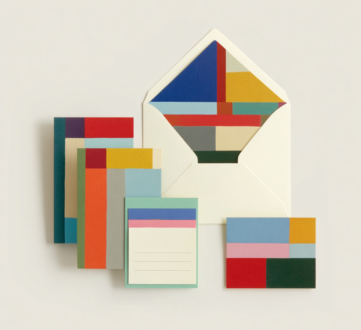
The identity is built on a modular grid of color blocks. Every company owns one color, and together they form the group palette.
A shared typeface, layout grid and naming structure keep every document, presentation and building sign unmistakably part of Meridian, while the color system makes each business easy to recognize.
Delivered
- Group monogram and wordmark suite
- Stationery, report and proposal templates
- Complete brand guidelines
More work
Keep exploring.


Start a project
Have a brand that needs this level of care?
Tell us about your company, your audience and your goals. We will come back with clear next steps.